Are bond market investors generally shrewder than their stock market counterparts, such that bond yield tops (bottoms) anticipate stock market bottoms (tops)? To investigate, we employ both a monthly lead-lag analysis and a comparison of bond yield and stock market tops and bottoms. We define “top” and “bottom” as the highest (lowest) value in a rolling window that extends from 30 months in the past to 30 months in the future (a total window of five years). Using monthly levels of Moody’s yield on seasoned Aaa corporate bonds and the Dow Jones Industrial Average (DJIA) during October 1928 through February 2018 (about 90 years) and monthly levels of the 10-year government bond interest rate and the stock market from Robert Shiller during January 1871 through February 2018 (about 148 years), we find that:
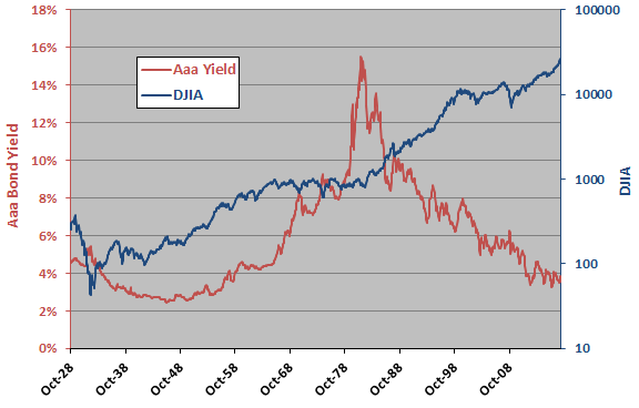
The following chart plots Aaa corporate bond yield and DJIA (logarithmic scale) over the available sample period. Visual inspection suggests a mostly inverse relationship, but it is not obvious whether one series reliably leads the other.
To investigate the short-term relationship between the two series, we relate monthly change in bond yield to monthly stock index return.
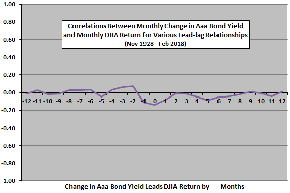
The next chart summarizes correlations for various lead-lag relationships between change in monthly Aaa bond yield and monthly DJIA return, ranging from DJIA return leads yield change by 12 months (-12) to yield change leads DJIA return by 12 months (12). Results are:
- No correlations are large.
- The strongest indication is negative coincident correlation. Relatively weak (strong) DJIA return tends to accompany rising (falling) bond yield. This relationship appears to spill over into adjacent leads/lags of one month, perhaps because Aaa bond yield is average of daily yields during the month (blurring the relationship).
- There is perhaps some tendency for relatively strong (weak) DJIA returns two to four months ago to predict rising (falling) bond yield.
- There is perhaps a weak and diffuse tendency for rising (falling) bond yield to predict relatively weak (strong) DJIA returns four to seven months later.
Next, we look at Aaa bond yield and DJIA long-term tops and bottoms.
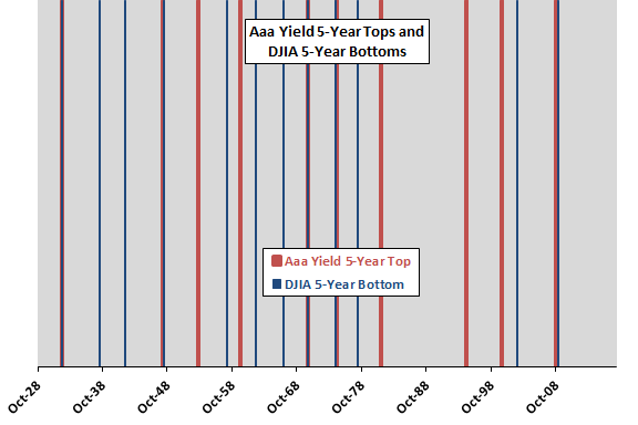
The next chart depicts Aaa bond yield tops (11 thick vertical red lines, one pair of which is a double signal) and DJIA bottoms (12 thin vertical blue lines) over the available sample period per the above definition. There are five cases for which bond yield tops and stock market bottoms roughly coincide. There are five cases for which bond yield tops appear unrelated to stock market bottoms. There are seven stock market bottoms that appear unrelated to bond yield tops.
What about bond yield bottoms and stock market tops?
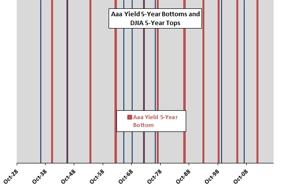
The next chart depicts Aaa bond yield bottoms (13 thick vertical red lines, two pairs of which are double signals) and DJIA bottoms (8 thin vertical blue lines) over the available sample period per the above definition. There are four cases for which bond yield bottoms and stock market tops roughly coincide. There are eight cases for which bond yield bottoms appear unrelated to stock market tops. There are four stock market tops that appear unrelated to bond yield bottoms.
Are results for the longer Shiller data series similar?
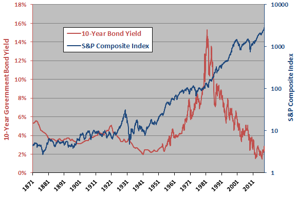
The next chart plots 10-year government bond yield and the S&P Composite Index (logarithmic scale) over the available sample period. As above, visual inspection suggests a sometimes inverse relationship, but it is not obvious whether one series reliably leads the other.
To investigate the short-term relationship between the two series, we relate monthly change in bond yield to monthly stock index return.
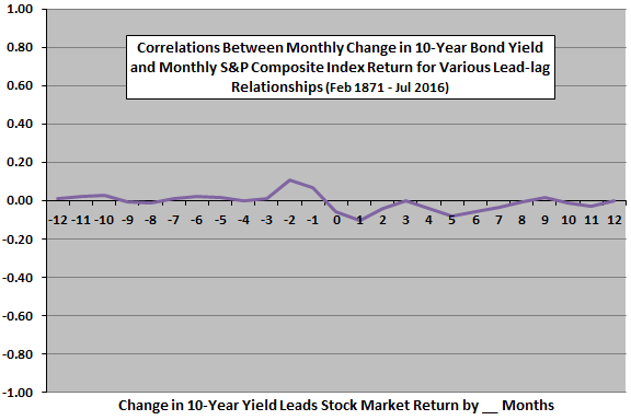
The next chart summarizes correlations for various lead-lag relationships between change in monthly 10-year government bond yield and monthly S&P Composite Index return, ranging from stock market return leads yield change by 12 months (-12) to yield change leads stock market return by 12 months (12). Results are:
- Again, no correlations are large.
- The strongest indication is positive correlation at -2, suggesting a tendency for relatively strong (weak) S&P Composite Index return to predict rising (falling) bond yield.
- The next strongest indication is negative coincident correlation. Relatively weak (strong) S&P Composite Index return tends to accompany rising (falling) bond yield. This relationship appears to spill over into adjacent leads/lags of one month, perhaps because both monthly series are averages of daily values during the month (blurring the relationship).
- There is perhaps again a weak tendency for rising (falling) bond yield to predict relatively weak (strong) S&P Composite Index returns four to seven months later.
Next, we look at 10-year government bond yield and S&P Composite Index long-term tops and bottoms.
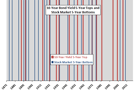
The next chart depicts 10-year government bond yield tops (16 thick vertical red lines) and S&P Composite Index bottoms (20 thin vertical blue lines) over the available sample period per the above specification. There are five cases for which bond yield tops and stock market bottoms roughly coincide. There are 11 cases for which bond yield tops appear unrelated to stock market bottoms. There are 15 stock market bottoms that appear unrelated to bond yield tops.
What about bond yield bottoms and stock market tops?
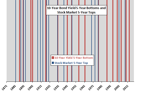
The final chart depicts 10-year government bond yield bottoms (17 thick vertical red lines) and S&P Composite Index tops (17 thin vertical blue lines) over the available sample period per the above specification. There are seven cases for which bond yield bottoms and stock market tops roughly coincide. There are 10 cases for which bond yield bottoms appear unrelated to stock market tops . There are 10 stock market tops that appear unrelated to bond yield tops.
As a final check, we look at average stock index returns before and after bond yield tops and bottoms for both samples.
The following table summarizes average stock index returns during the 30 months before and 30 months after bond market tops and bottoms over available sample periods. Stock index returns around extreme Aaa yields are DJIA returns. Stock index returns around extreme 10-year government bond yields are S&P Composite Index returns.
Results mostly indicate that the stock market performs better after than before bond yield tops, and before than after bond yield bottoms. In other words, falling bond yields are on average better than rising bond yields for the stock market. However:
- Sample sizes for bond yield extremes are small for reliable inference.
- Exploitation requires accurate bond yield forecasting.

In summary, evidence provides some support for, but not much confidence in, belief that falling (rising) U.S. bond yields are good (bad) for future U.S. stock market performance. Exploitation, however, requires reasonably accurate bond yield forecasts.
Cautions regarding findings include:
- As noted, the definitions of market tops and bottoms assume perfect 30-month foresight. An investor operating in real time could not identify them.
- As noted, the numbers of bond yield extremes are small for reliable inference.
- Other definitions of series tops and bottoms may produce different results.
- As noted, the Aaa bond yield series and the Shiller series are “blurry” in that monthly values are averages of daily data. This approach is problematic for short measurement intervals (as in the above monthly lead-lag analyses), but less so for long measurement intervals.